3D Product Configurator: 5 Key Elements to Keep in Mind for UX/UI
Table of Contents
When it comes to designing a 3D product configurator, user experience (UX) e user interface (UI) play a crucial role. 3D configurators allow consumers to personalize products in a unique e memorabili e coinvolgenti way. To ensure the success of your configurator, it’s essential not to overlook certain key elements.
In this article, we’ll explore five essential aspects to consider for creating an exceptional user experience when designing a 3D product configurator. Whether you’re an experienced designer or a novice looking to enhance your skills, these tips will guide you in creating a powerful, engaging, e interattiva tool for your customers.
- Don't Recreate Your In-Store Customer Experience
- Don't Recreate Your In-Store Customer Experience

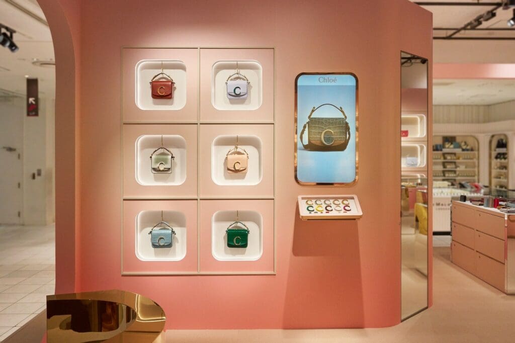
Each channel has its own specificity. While it may be tempting to replicate your in-store customer experience online, it would be wiser to opt for a differentiated customer journey that caters to the specifics of the channel.
Indeed, where your in-store customer is guided from entry to exit, the online experience is much more solitary. Your customer’s attention won’t be the same as when they are accompanied by sales associates and immersed in the brand’s universe with a carefully orchestrated sales ceremony. This means you need to be much more instructive throughout the online product configurator journey.
In online experiences, you face an additional challenge: engaging your customers with a fun and interactive experience. User retention throughout the journey is key.
Therefore, it is necessary to think about integrating technical choices (e.g., measuring the dimensions of a bracelet) while keeping customers engaged in an overall entertaining experience (e.g., choosing colors, materials for each editable part, real-time interaction with the product, AR).
Is it more prudent to place these elements at the beginning of your experience, at the risk of boring potential customers, or should you integrate them more fluidly into the customer journey? Such questions might seem obvious at first, but it is essential to take a step back and ask the right questions before proceeding.
If you manage to offer a compelling experience, chances are your user will get involved and spend time selecting their ideal 3D configuration. As a result, they will tend to take ownership of the product, move more easily to the technical part, and visualize themselves in the purchasing act.
- Prioritize the Mobile Experience
- Prioritize the Mobile Experience

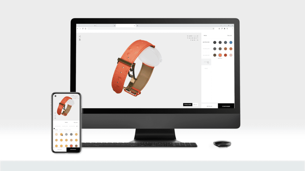
You are undoubtedly aware of the importance of the mobile experience. According to a study, 55% of online visits occur on mobile devices. Based on our clients’ experiences in the fashion and luxury industries, this often rises to 80% for interactive product customization experiences.
A good piece of advice would be to start designing your 3D product configurator with a “mobile-first” approach, meaning you begin the design process on mobile and then adapt it for desktop use. From a UX design perspective, it is easier to add space in a layout than to condense everything onto a mobile screen.
- Limit the Choices You Offer Your Customers
- Limit the Choices You Offer Your Customers

You have a passion for craftsmanship, and nothing is too complicated for you to produce. You want to offer your customers a world of possibilities without any limitations. However, this isn’t necessarily the best approach.
Offering too many product combinations can ultimately confuse your customers and lead to a poor user experience.
So, what approach should you take when your product consists of numerous parts?
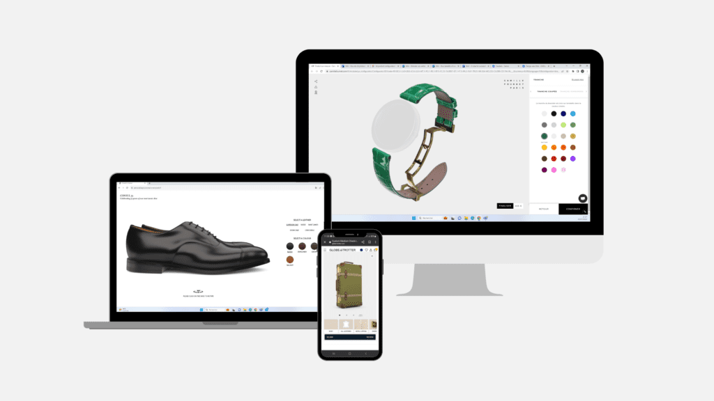
For example, designing a Globe-Trotter suitcase could involve more than 10 separate elements to choose from: the 4 wheels, the 4 corners of the suitcase, the handle, the metals, the interior fabric, the elastic colors, the two exterior straps, and so on. Selecting these elements one by one would be a long and tedious task.
We recommend that brands with a high level of product customization group configuration elements to simplify and streamline the experience.
Returning to the Globe-Trotter suitcase example, we advised grouping all the leather straps. Thus, when one strap changes color and material, the others change as well. This removes non-essential steps from the configuration process and offers a simplified and dynamic interactive product customization strategy.
- Don’t Copy Your Competitor’s Experience
- Don’t Copy Your Competitor’s Experience

Ce point peut paraître évident mais il n’y a rien de plus humain que de vouloir répliquer une expérience qui fonctionne extrêmement bien, ou qui en a l’air, chez votre concurrent. On dira ensuite que l’on souhaite simplement s’en inspirer, et puis on se retrouve à avoir une maquette d’un configurateur produit extrêmement similaire à celle du voisin.
Prenez de la hauteur, gardez uniquement les fonctionnalités qui vous semblent essentielles puis concevez votre maquette à votre image, en mettant en avant ce qui rend votre marque unique.
Votre histoire, votre savoir-faire vous appartient et c’est à vous de le mettre en avant pour inspirer les autres. Sortez des sentiers battus, soyez créatifs et n’oubliez jamais votre identité de marque.
Ce qui a fonctionné pour d’autre, ne fonctionnera pas nécessairement sur votre marque. Chaque produit a son univers et ses possibilités qui lui sont propres. Cette expérience de personnalisation produit doit respirer l’ADN de votre marque.
- Ask the Right Questions During Your UX Design Process
- Ask the Right Questions During Your UX Design Process

The expression “Less is more” speaks for itself.
When designing an experience, always question the necessity of each feature.
Do we need this button if it’s already present higher up on the page?
Do we really need this additional pop-up that might never be read?
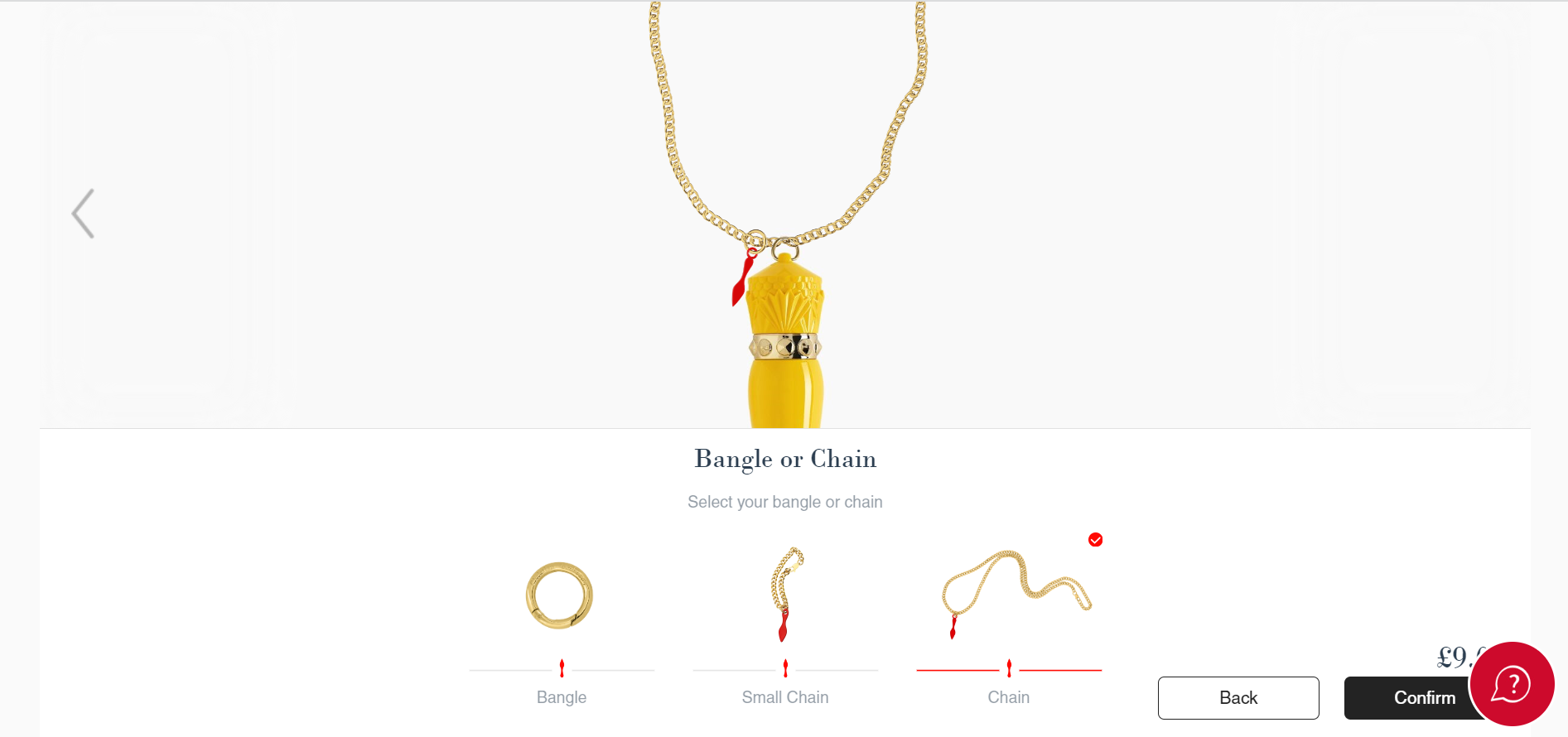
No one likes to be overwhelmed with visual information when opening an e-commerce page. To highlight the product as much as possible, you need to streamline your interface. It should be clear, with the most important information standing out and accessible with the fewest clicks possible.
It’s also important to ensure that additional features are available if desired. For instance, you could add a menu in the corner grouping secondary features or a chat service to better assist your users.
In conclusion, designing a 3D product configurator is a complex challenge that requires meticulous attention to user experience (UX) e user interface (UI). It’s crucial to create a distinctive online experience, avoiding simply replicating the in-store experience. Your configurator should be instructive, engaging, and entertaining for users, while addressing the challenges of online interaction. It should reflect what makes your brand unique, with simplicity and clarity being the guiding principles of your design.
By following these tips and keeping the importance of UX/UI in mind, you are on the right track to creating an exceptional 3D product configurator that will delight your customers and encourage them to engage more deeply in the purchasing process.